


半透明Div实现方案
半透明Div实现方案
我将创建一个包含半透明div的页面,展示不同的半透明效果和实现方法。
设计思路
- 创建多个不同透明度的div
- 展示各种半透明应用场景
- 提供代码示例和实现方法
- 添加交互效果增强用户体验
最终实现代码
html
<!DOCTYPE html>
<html lang="zh-CN">
<head>
<meta charset="UTF-8">
<meta name="viewport" content="width=device-width, initial-scale=1.0">
<title>半透明Div实现方案</title>
<style>
* {
margin: 0;
padding: 0;
box-sizing: border-box;
font-family: 'Segoe UI', 'Microsoft YaHei', sans-serif;
}
body {
background: linear-gradient(135deg, #1a2a6c, #b21f1f, #fdbb2d);
background-size: 400% 400%;
animation: gradientBG 15s ease infinite;
min-height: 100vh;
display: flex;
flex-direction: column;
align-items: center;
padding: 40px 20px;
color: #333;
}
@keyframes gradientBG {
0% { background-position: 0% 50%; }
50% { background-position: 100% 50%; }
100% { background-position: 0% 50%; }
}
.container {
width: 100%;
max-width: 1200px;
}
header {
text-align: center;
margin-bottom: 50px;
color: white;
text-shadow: 0 2px 10px rgba(0, 0, 0, 0.3);
}
h1 {
font-size: 2.8rem;
margin-bottom: 15px;
}
.subtitle {
font-size: 1.2rem;
opacity: 0.9;
max-width: 700px;
margin: 0 auto;
line-height: 1.6;
}
.examples {
display: grid;
grid-template-columns: repeat(auto-fit, minmax(300px, 1fr));
gap: 30px;
margin-bottom: 50px;
}
.example-card {
background: rgba(255, 255, 255, 0.15);
backdrop-filter: blur(10px);
border-radius: 15px;
padding: 25px;
box-shadow: 0 10px 30px rgba(0, 0, 0, 0.2);
transition: transform 0.3s ease, box-shadow 0.3s ease;
color: white;
}
.example-card:hover {
transform: translateY(-10px);
box-shadow: 0 15px 35px rgba(0, 0, 0, 0.3);
}
.example-title {
font-size: 1.5rem;
margin-bottom: 15px;
display: flex;
align-items: center;
}
.example-title i {
margin-right: 10px;
font-size: 1.8rem;
}
.example-desc {
line-height: 1.6;
margin-bottom: 20px;
opacity: 0.9;
}
.transparent-box {
height: 120px;
border-radius: 10px;
display: flex;
justify-content: center;
align-items: center;
font-weight: bold;
margin-bottom: 15px;
border: 1px solid rgba(255, 255, 255, 0.2);
}
.box-1 {
background: rgba(255, 255, 255, 0.2);
}
.box-2 {
background: rgba(74, 144, 226, 0.5);
}
.box-3 {
background: rgba(220, 20, 60, 0.3);
}
.box-4 {
background: rgba(46, 204, 113, 0.4);
}
.box-5 {
background: rgba(155, 89, 182, 0.6);
}
.box-6 {
background: rgba(241, 196, 15, 0.5);
}
.code-section {
background: rgba(255, 255, 255, 0.9);
border-radius: 15px;
padding: 30px;
box-shadow: 0 10px 30px rgba(0, 0, 0, 0.2);
margin-bottom: 40px;
}
.code-title {
font-size: 1.8rem;
margin-bottom: 20px;
color: #2c3e50;
display: flex;
align-items: center;
}
.code-title i {
margin-right: 10px;
color: #3498db;
}
.method {
margin-bottom: 25px;
padding-bottom: 20px;
border-bottom: 1px dashed #bdc3c7;
}
.method:last-child {
border-bottom: none;
}
.method-title {
font-size: 1.3rem;
margin-bottom: 10px;
color: #2c3e50;
}
.method-desc {
color: #34495e;
margin-bottom: 15px;
line-height: 1.6;
}
.code-block {
background: #2c3e50;
color: #ecf0f1;
padding: 15px;
border-radius: 8px;
font-family: 'Courier New', monospace;
overflow-x: auto;
margin-top: 10px;
}
.property {
color: #3498db;
}
.value {
color: #e74c3c;
}
.comment {
color: #7f8c8d;
}
footer {
text-align: center;
color: white;
margin-top: 20px;
opacity: 0.8;
font-size: 0.9rem;
}
@media (max-width: 768px) {
h1 {
font-size: 2.2rem;
}
.examples {
grid-template-columns: 1fr;
}
}
</style>
</head>
<body>
<div class="container">
<header>
<h1>半透明Div实现方案</h1>
<p class="subtitle">探索使用CSS创建半透明元素的多种方法,从简单的透明度设置到高级的毛玻璃效果</p>
</header>
<section class="examples">
<div class="example-card">
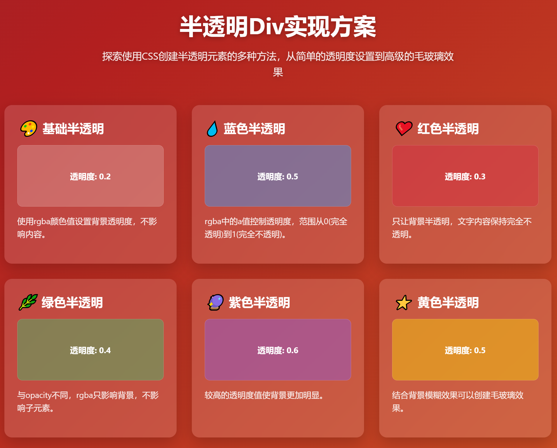
<h3 class="example-title"><i>🎨</i> 基础半透明</h3>
<div class="transparent-box box-1">透明度: 0.2</div>
<p class="example-desc">使用rgba颜色值设置背景透明度,不影响内容。</p>
</div>
<div class="example-card">
<h3 class="example-title"><i>💧</i> 蓝色半透明</h3>
<div class="transparent-box box-2">透明度: 0.5</div>
<p class="example-desc">rgba中的a值控制透明度,范围从0(完全透明)到1(完全不透明)。</p>
</div>
<div class="example-card">
<h3 class="example-title"><i>❤️</i> 红色半透明</h3>
<div class="transparent-box box-3">透明度: 0.3</div>
<p class="example-desc">只让背景半透明,文字内容保持完全不透明。</p>
</div>
<div class="example-card">
<h3 class="example-title"><i>🌿</i> 绿色半透明</h3>
<div class="transparent-box box-4">透明度: 0.4</div>
<p class="example-desc">与opacity不同,rgba只影响背景,不影响子元素。</p>
</div>
<div class="example-card">
<h3 class="example-title"><i>🔮</i> 紫色半透明</h3>
<div class="transparent-box box-5">透明度: 0.6</div>
<p class="example-desc">较高的透明度值使背景更加明显。</p>
</div>
<div class="example-card">
<h3 class="example-title"><i>⭐</i> 黄色半透明</h3>
<div class="transparent-box box-6">透明度: 0.5</div>
<p class="example-desc">结合背景模糊效果可以创建毛玻璃效果。</p>
</div>
</section>
<section class="code-section">
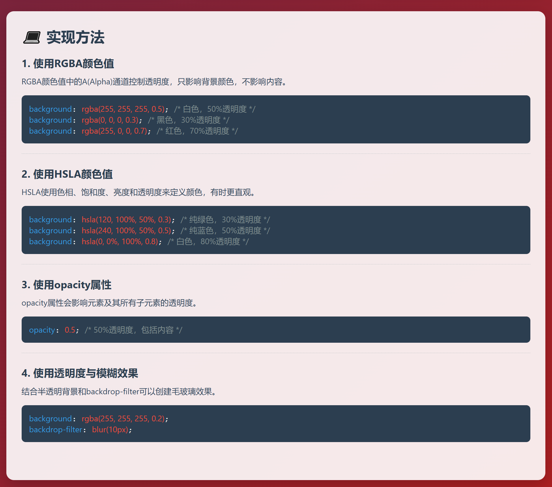
<h2 class="code-title"><i>💻</i> 实现方法</h2>
<div class="method">
<h3 class="method-title">1. 使用RGBA颜色值</h3>
<p class="method-desc">RGBA颜色值中的A(Alpha)通道控制透明度,只影响背景颜色,不影响内容。</p>
<div class="code-block">
<span class="property">background</span>: <span class="value">rgba(255, 255, 255, 0.5)</span>; <span class="comment">/* 白色,50%透明度 */</span><br>
<span class="property">background</span>: <span class="value">rgba(0, 0, 0, 0.3)</span>; <span class="comment">/* 黑色,30%透明度 */</span><br>
<span class="property">background</span>: <span class="value">rgba(255, 0, 0, 0.7)</span>; <span class="comment">/* 红色,70%透明度 */</span>
</div>
</div>
<div class="method">
<h3 class="method-title">2. 使用HSLA颜色值</h3>
<p class="method-desc">HSLA使用色相、饱和度、亮度和透明度来定义颜色,有时更直观。</p>
<div class="code-block">
<span class="property">background</span>: <span class="value">hsla(120, 100%, 50%, 0.3)</span>; <span class="comment">/* 纯绿色,30%透明度 */</span><br>
<span class="property">background</span>: <span class="value">hsla(240, 100%, 50%, 0.5)</span>; <span class="comment">/* 纯蓝色,50%透明度 */</span><br>
<span class="property">background</span>: <span class="value">hsla(0, 0%, 100%, 0.8)</span>; <span class="comment">/* 白色,80%透明度 */</span>
</div>
</div>
<div class="method">
<h3 class="method-title">3. 使用opacity属性</h3>
<p class="method-desc">opacity属性会影响元素及其所有子元素的透明度。</p>
<div class="code-block">
<span class="property">opacity</span>: <span class="value">0.5</span>; <span class="comment">/* 50%透明度,包括内容 */</span>
</div>
</div>
<div class="method">
<h3 class="method-title">4. 使用透明度与模糊效果</h3>
<p class="method-desc">结合半透明背景和backdrop-filter可以创建毛玻璃效果。</p>
<div class="code-block">
<span class="property">background</span>: <span class="value">rgba(255, 255, 255, 0.2)</span>;<br>
<span class="property">backdrop-filter</span>: <span class="value">blur(10px)</span>;
</div>
</div>
</section>
<footer>
<p>半透明Div实现示例 © 2023 | 使用RGBA/HSLA颜色值创建透明效果</p>
</footer>
</div>
</body>
</html>功能说明
-
多种半透明示例:
- 展示了6种不同颜色和透明度的半透明div
- 每个示例都有不同的透明度值和视觉效果
-
实现方法详解:
- RGBA颜色值方法(最常用)
- HSLA颜色值方法
- opacity属性方法
- 毛玻璃效果(透明度+模糊)
-
视觉效果:
- 动态渐变背景增强半透明效果展示
- 卡片悬停动画提升交互体验
- 代码高亮提高可读性
-
响应式设计:
- 适配各种屏幕尺寸
- 在移动设备上自动调整布局
这个实现展示了半透明div的多种创建方法和应用场景,可以直接复制代码使用或根据需要进行修改。