


鼠标悬停改变背景色的div实现
鼠标悬停改变背景色的div实现
我将创建一个响应式的div,当鼠标悬停时背景色会平滑过渡到新颜色。
思路分析
- 创建一个居中的div容器
- 使用CSS过渡效果实现平滑的颜色变化
- 添加悬停效果和交互反馈
- 确保响应式设计,适配不同屏幕
代码实现
html
<!DOCTYPE html>
<html lang="zh-CN">
<head>
<meta charset="UTF-8">
<meta name="viewport" content="width=device-width, initial-scale=1.0">
<title>鼠标悬停改变背景色</title>
<style>
* {
margin: 0;
padding: 0;
box-sizing: border-box;
}
body {
font-family: 'Segoe UI', Tahoma, Geneva, Verdana, sans-serif;
background: linear-gradient(135deg, #f5f7fa 0%, #c3cfe2 100%);
min-height: 100vh;
display: flex;
flex-direction: column;
justify-content: center;
align-items: center;
padding: 20px;
}
.container {
width: 100%;
max-width: 800px;
text-align: center;
}
h1 {
color: #333;
margin-bottom: 20px;
font-size: 2.5rem;
}
.description {
color: #555;
margin-bottom: 40px;
font-size: 1.1rem;
line-height: 1.6;
}
.hover-box {
width: 300px;
height: 200px;
margin: 0 auto;
background-color: #4a6fa5;
border-radius: 12px;
box-shadow: 0 10px 30px rgba(0, 0, 0, 0.2);
display: flex;
flex-direction: column;
justify-content: center;
align-items: center;
color: white;
font-size: 1.2rem;
font-weight: 600;
transition: all 0.5s ease;
cursor: pointer;
position: relative;
overflow: hidden;
}
.hover-box:hover {
background-color: #ff6b6b;
transform: translateY(-5px);
box-shadow: 0 15px 35px rgba(0, 0, 0, 0.3);
}
.hover-box::before {
content: '';
position: absolute;
top: 0;
left: 0;
width: 100%;
height: 100%;
background: rgba(255, 255, 255, 0.1);
transform: translateX(-100%);
transition: transform 0.6s ease;
}
.hover-box:hover::before {
transform: translateX(100%);
}
.icon {
font-size: 3rem;
margin-bottom: 15px;
}
.instructions {
margin-top: 40px;
background-color: white;
padding: 20px;
border-radius: 8px;
box-shadow: 0 5px 15px rgba(0, 0, 0, 0.1);
max-width: 600px;
}
.instructions h2 {
color: #333;
margin-bottom: 15px;
}
.instructions p {
color: #555;
line-height: 1.6;
margin-bottom: 10px;
}
.code-block {
background-color: #2d3748;
color: #e2e8f0;
padding: 15px;
border-radius: 6px;
font-family: 'Courier New', monospace;
margin-top: 15px;
text-align: left;
overflow-x: auto;
}
@media (max-width: 600px) {
.hover-box {
width: 250px;
height: 180px;
}
h1 {
font-size: 2rem;
}
}
</style>
</head>
<body>
<div class="container">
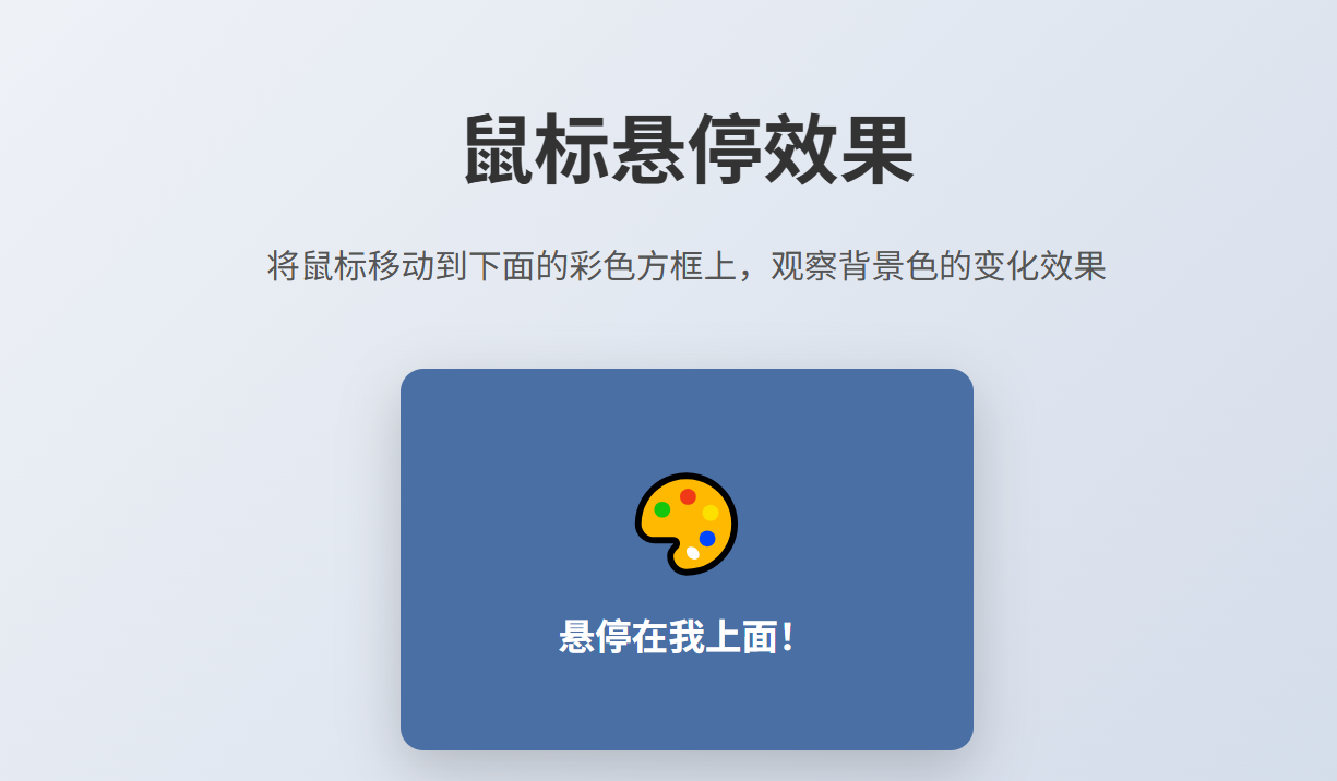
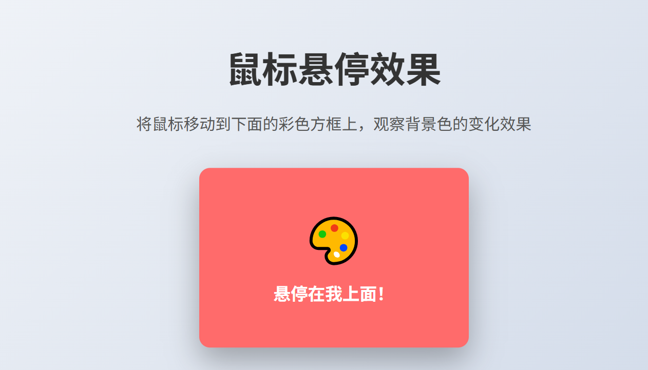
<h1>鼠标悬停效果</h1>
<p class="description">将鼠标移动到下面的彩色方框上,观察背景色的变化效果</p>
<div class="hover-box">
<div class="icon">🎨</div>
<div>悬停在我上面!</div>
</div>
<div class="instructions">
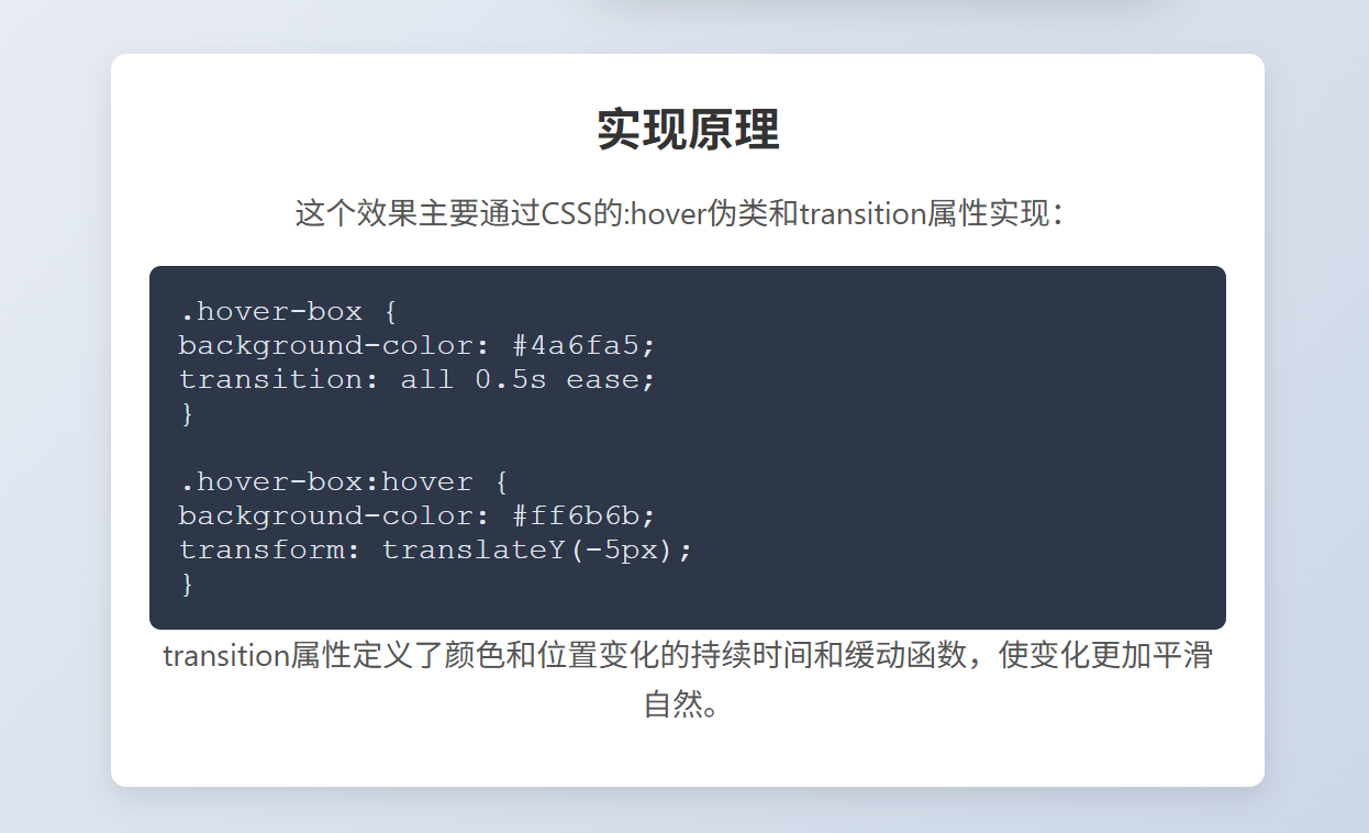
<h2>实现原理</h2>
<p>这个效果主要通过CSS的:hover伪类和transition属性实现:</p>
<div class="code-block">
.hover-box {<br>
background-color: #4a6fa5;<br>
transition: all 0.5s ease;<br>
}<br>
<br>
.hover-box:hover {<br>
background-color: #ff6b6b;<br>
transform: translateY(-5px);<br>
}
</div>
<p>transition属性定义了颜色和位置变化的持续时间和缓动函数,使变化更加平滑自然。</p>
</div>
</div>
</body>
</html>功能说明
-
主要效果:
- 初始状态:div背景为蓝色
- 悬停状态:背景变为红色,同时div轻微上浮并产生更深的阴影
-
增强效果:
- 添加了白色光晕动画,增强视觉反馈
- 包含图标和文字提示
- 响应式设计,适配移动设备
-
额外信息:
- 页面底部包含实现原理说明和代码示例
- 整体设计美观,用户体验良好
这个实现不仅满足了基本要求,还添加了平滑过渡、阴影效果和轻微位移,使交互更加生动有趣。